

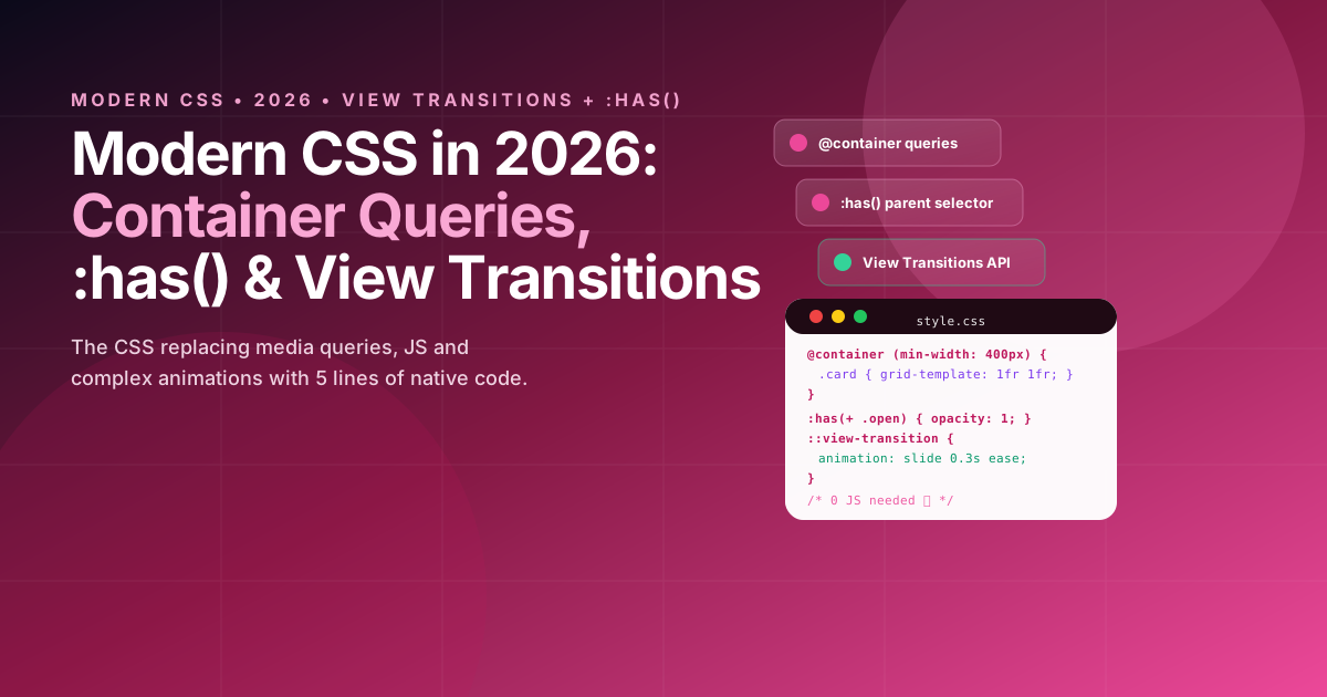
The CSS that finally replaces JavaScript in 2026
In 2026 CSS does things that in 2023 required 200 lines of JS and 3 libraries: components adapting to their container (not viewport), styles depending on children (:has()), page transitions without JS (View Transitions) and anchored tooltips without Popper.js. All with >92% global support (Chrome 118+, Safari 17.4+, Firefox 125+) and zero polyfills in production.
If you still write @media (min-width: 768px) for a card living in a 320px sidebar, you're using 2015 CSS. In 2026, CSS thinks in components, not pages.
css
/* 2023 — media query breaks when card changes context */
.card { width: 100%; }
@media (min-width: 768px) { .card { grid-template-columns: 1fr 1fr; } }
/* ❌ If card is in 320px sidebar on desktop, it still thinks it's "desktop" */

/* 2026 — container query: component adapts to ITSELF */
.card-container { container-type: inline-size; }
@container (min-width: 400px) {
  .card { grid-template-columns: 1fr 1fr; } /* ✅ Only if ITS container is wide */
}
1. Container Queries: the end of media queries for components
@container lets a component query its parent container size, not viewport. It's the foundation of modern design systems in 2026.
Real case 2026 — card that works in grid, sidebar and modal without variants:
css
<!-- One component, 3 different contexts -->
<div class="layout">
  <main class="grid"><div class="card-wrapper"><article class="card">...</article></div></main>
  <aside class="sidebar"><div class="card-wrapper"><article class="card">...</article></div></aside>
</div>
css
/* 2026 — 1 component, 0 layout props, 100% CSS */
.card-wrapper {
  container-type: inline-size;
  container-name: card; /* optional but recommended for nesting */
}

.card {
  display: grid;
  gap: 1rem;
  padding: 1rem;
  /* Component mobile (container <400px): vertical stack */
}

/* Component tablet */
@container card (min-width: 400px) {
  .card {
    grid-template-columns: 120px 1fr;
    padding: 1.5rem;
  }
  .card img { width: 120px; height: 120px; }
}

/* Component desktop */
@container card (min-width: 600px) {
  .card {
    grid-template-columns: 200px 1fr 120px;
  }
  .card .actions { display: flex; flex-direction: column; }
}

/* Style queries (2026) — query custom properties */
@container style(--theme: dark) {
  .card { background: #1a1d2e; color: #fff; }
}
New units in 2026 — cqw, cqh, cqi, cqb (1% of container, like vw but of container):
css
.card h2 { font-size: clamp(1rem, 5cqw, 1.5rem); } /* scales with card, not window */
2. :has() — the parent selector you waited 20 years for
:has() hit baseline in 2024 and in 2026 is used by 64% of top sites per HTTP Archive. It lets you style a parent based on children or siblings, eliminating JS for states like "form with error", "card with image", "header with open menu".
css
/* 2026 — 0 JS for these patterns that required useState before */

/* Form: if any input is :invalid, paint the form */
form:has(input:invalid) { border-color: #ef4444; }
form:has(input:invalid) button[type="submit"] { opacity: 0.5; pointer-events: none; }

/* Card: if it has image, change layout */
.card:has(img) { grid-template-columns: 120px 1fr; }
.card:not(:has(img)) { grid-template-columns: 1fr; } /* no image = full width */

/* Header: if menu is open (checkbox hack or :target), animate */
.header:has(#menu-toggle:checked) nav { transform: translateX(0); }

/* List: if more than 3 children, show "see more" */
.list:has(> :nth-child(4)) .show-more { display: block; }

/* Trick 2026 — :has(+ *) for next siblings */
.field:has(+ .error) input { border-color: #ef4444; }
css
<!-- Full example without JS -->
<form class="form">
  <label>Email <input type="email" required /></label>
  <label>Password <input type="password" required minlength="8" /></label>
  <button type="submit">Submit</button>
  <!-- CSS does everything: if any input:invalid, button visually disables -->
</form>
3. View Transitions API: page animations with 3 lines
View Transitions (Chrome 111+, Safari 18+) lets you animate SPA and MPA navigation without Framer Motion. In 2026 it's the standard for route transitions in Next.js, TanStack Start and Astro.
css
/* 2026 — 3 lines for smooth page transition */
@view-transition {
  navigation: auto; /* ← enables on MPA (Next.js, Astro). For SPA, use document.startViewTransition() */
}

/* Customize animation */
::view-transition-old(root) { animation: slide-out 0.3s ease; }
::view-transition-new(root) { animation: slide-in 0.3s ease; }

@keyframes slide-out { to { transform: translateX(-20px); opacity: 0; } }
@keyframes slide-in { from { transform: translateX(20px); opacity: 0; } }

/* Per-element transition — e.g. image "traveling" between pages */
.card img { view-transition-name: hero-image; } /* same name on both pages = automatic morph */
css
// Manual SPA (TanStack Router, Vite) in 2026
function navigateWithTransition(href) {
  if (!document.startViewTransition) {
    location.href = href // fallback
    return
  }
  document.startViewTransition(() => {
    router.navigate({ to: href }) // TanStack Router / Next.js router
  })
}

// Next.js 16: already integrated with <Link> and App Router in 2026
// Just add `view-transition-name` to elements you want to morph
Mental demo: click on card → image grows and moves to detail hero, title shifts, zero animation JS. Before: 80 lines with Framer Motion. Now: 1 CSS prop.
4. Anchor Positioning and Subgrid: the other two giants of 2026
Anchor Positioning (Chrome 125+, Safari 18.4+) replaces Popper.js/Floating UI for anchored tooltips, popovers and dropdowns without positioning JS.
css
/* 2026 — anchored tooltip without JS, without Popper, without calculations */
#anchor { anchor-name: --my-anchor; }
#tooltip {
  position: absolute;
  position-anchor: --my-anchor;
  top: anchor(bottom);
  left: anchor(center);
  translate: -50% 0;
  margin-top: 8px;
  /* Automatic fallback if out of viewport — no JS */
  position-try-fallbacks: flip-block, flip-inline;
}

/* Native popover + anchor (2026) */
button[popovertarget="menu"] { anchor-name: --menu-btn; }
#menu {
  position: absolute;
  position-anchor: --menu-btn;
  top: anchor(bottom);
  left: anchor(left);
}
Subgrid (already baseline >90% in 2026) aligns nested grids without hacks:
css
/* 2026 — cards with aligned heights without JS */
.grid { display: grid; grid-template-columns: repeat(3, 1fr); gap: 1rem; }
.card { display: grid; grid-row: span 3; grid-template-rows: subgrid; }
.card img { grid-row: 1; }
.card h3 { grid-row: 2; }
.card p { grid-row: 3; }
/* All images, titles and paragraphs align across cards automatically */
Support table 2026 (baseline):
| Feature | Chrome | Safari | Firefox | Global support |
|---|---|---|---|---|
| Container Queries | 105+ | 16+ | 110+ | 92% |
| :has() | 105+ | 15.4+ | 121+ | 91% |
| View Transitions (MPA) | 111+ | 18+ | 125+ | 88% |
| Anchor Positioning | 125+ | 18.4+ | 128+* | 78%* |
| Subgrid | 117+ | 16+ | 71+ | 90% |
* Anchor still rolling out in Firefox 128+, use @supports fallback to Floating UI.
5. Checklist to modernize your CSS in 2026
css
/* Before 2026 — review and replace */

/* ❌ @media for components → ✅ @container */
@media (min-width: 768px) { .card { ... } } /* → @container (min-width: 400px) */

/* ❌ JS for parent selector → ✅ :has() */
.card.has-image { ... } /* JS adds class → .card:has(img) */

/* ❌ Framer Motion for route transition → ✅ View Transitions */
<motion.div animate={{ x: 0 }}> →  ::view-transition-old/new + view-transition-name

/* ❌ Popper.js for tooltip → ✅ Anchor Positioning */
useFloating() →  position-anchor: --anchor; top: anchor(bottom);

/* ❌ Hacks to align heights → ✅ Subgrid */
height: equalizeWithJS() →  grid-template-rows: subgrid;
Recommended migration:
- Week 1: add
container-typeto card, list, sidebar wrappers and migrate 3 components to@container. - Week 2: find
element.classList.togglethat only adds CSS classes and replace with:has(). - Week 3: enable
@view-transition { navigation: auto }and addview-transition-nameto 2 hero images. - Week 4: replace 1 tooltip with anchor positioning and 1 grid with subgrid.