
Why your app looks AI-made
It is never one thing. It is the same four details repeating in every generated app: blank screens while loading, texts and buttons competing with each other, a different blue on each screen, and light grays nobody can read in sunlight. You do not fix that by asking "make it prettier". You fix it by asking for concrete things.
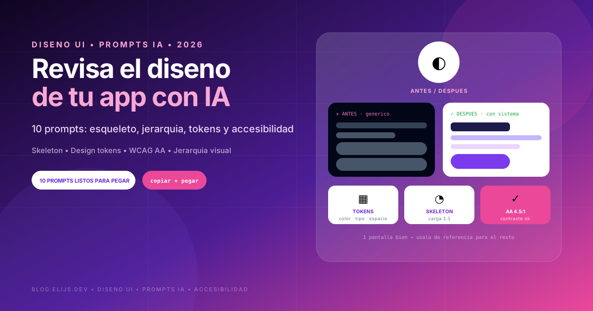
This guide has two parts. First, the 4 rules explained simply. Then 10 prompts to apply them inside your project, one at a time, starting with the first screen your user sees. When that one looks right, use it as the reference for the rest.
How to use these prompts
Run one prompt at a time, inside your project so the AI can read your code. Start with a single screen. Do not ask for a full redesign at once: work screen by screen and confirm each change before moving on.
- If your app already has colors, typography and a logo, paste them into every prompt.
- If it has no identity, run prompt 4 first, because everything else depends on it.
- Always ask for the complete final code, not loose fragments.
The 4 rules that change everything
1. Skeleton loading
Today your app shows a blank screen or a spinner. Users do not know what is coming or how long it takes. Skeleton loading shows the shape of what is coming: gray blocks where the title, photo and list will land. It feels faster even when it takes the same time, and nothing jumps when content appears.
2. Visual hierarchy
Agents love adding extra paragraphs, extra titles and three same-size buttons. Users land and do not know where to look. Hierarchy means deciding what matters most on each screen and making it look bigger, higher or stronger. One primary action per screen. Everything else, secondary.
3. Design tokens
Your design decisions saved with names: primary color, background, text, spacing, font sizes, radius. Without them, the AI uses one blue here, another there, a different gray per screen. Users cannot explain it, but they feel something is off.
4. Accessibility
It is not only for people with disabilities. It is what makes your app usable in sunlight or with a big thumb on a phone. Two numbers to know:
- Contrast: normal text needs at least 4.5 to 1 against its background (WCAG level AA). Light gray on white almost never passes.
- Touch target: buttons need at least 44 by 44 points on iOS or 48 by 48 on Android. The tiny icons AI generates usually fall short.
1. Diagnosis: what gives my app away
Run this before the rest. Diagnosis only, no code changes yet.
js
Act as a product designer reviewing an AI-built app.
Tell me why my app looks generic and what gives it away.

Here is what I have:
[PASTE HERE your main screens code, or screenshots
if your AI can see them]

Review these 7 points:
1. Colors: how many I use and whether each screen uses its own
2. Typography: sizes and weights, and whether there is a clear scale
3. Spacing: pattern-based margins or loose values
4. Hierarchy: whether each screen reads in one second
5. Copy: filler paragraphs, generic titles, text nobody reads
6. States: what shows while loading, when empty, on error
7. Details that scream "an AI made this"

Answer like this:
- First impression: what my app communicates today, two honest lines
- The 5 most telling problems, ordered by visual impact
- For each: what I see today, what I should see, and why
- What to fix first

Do not change code yet, diagnosis only.
2. Skeleton loading
js
Act as a frontend developer specialized in user experience.
Replace my blank screens and spinners with skeleton loading.

Here is what I have:
[PASTE HERE the screen code and how it loads data today]

Do this:
1. Show me where the loading state is today and what users see
2. Build a skeleton with the same shape and size as the real
   content, so nothing jumps when it loads
3. Use a soft animation, not an aggressive blink
4. Respect the system reduced-motion preference
5. Tell me what to do on slow load or failure, so users never
   stare at a skeleton forever
6. Make it reusable for other screens

Give me the complete final code and how to test it on slow network.
3. Visual hierarchy
js
Act as a product designer fixing a confusing screen.
Make it obvious in one second what matters here.

Here is what I have:
[PASTE HERE the screen code and tell me the action you want
users to take here]

Do this:
1. Tell me what the eye sees first today and if it matches my goal
2. Mark text to cut: explanations, subtitles repeating the title
3. Rewrite what stays, shorter and direct
4. Define one primary element, downgrade everything else
5. Adjust sizes, weights and spacing to show that difference
6. Group what belongs together, separate what does not

Show me before and after, one line per change.
4. Design tokens
js
Act as a design-systems designer.
Organize my colors, type and spacing into named tokens.

Here is what I have:
[PASTE HERE your styles file or Tailwind config, plus two
or three screens]

Do this:
1. List the colors, font sizes and spacings I use today, with counts
2. Propose a small token set named by role, not color: background,
   surface, primary text, secondary text, border, accent,
   success, error
3. Define a type scale and a spacing scale, few steps
4. Give me that token code for my stack, ready to paste
5. Show me one screen using tokens only
6. Tell me which loose values to replace and where

If my app has a brand, respect it. If not, propose a sober palette
and explain why those colors.
5. Typography and spacing
js
Act as a designer reviewing typography and visual rhythm.
Make my app read well and feel ordered.

Here is what I have:
[PASTE HERE your screens code and styles config]

Review:
1. How many font sizes I use and which ones to drop
2. Whether body text reads comfortably on mobile
3. Line height and line length
4. Whether titles differ by size and weight, not just color
5. Whether spacing follows a scale or loose values
6. Whether sections have air or everything is cramped

Give me the fixed scale plus one screen before and after.
6. Accessible contrast and color
js
Act as an accessibility specialist reviewing an interface.
Review contrast and color use in my app.

Here is what I have:
[PASTE HERE your colors and screens code, dark mode included
if you have it]

Review:
1. Every text-background pair, with its computed ratio
2. Which miss 4.5 to 1 for normal text or 3 to 1 for large text
3. Interface contrast: field borders, icons, buttons
4. Anything communicated by color alone, like red-only errors
5. Whether dark mode has the same issues
6. Text over images or gradients, usually the worst case

Answer with a table: element, current colors, ratio,
pass or fail, and the closest fixed color to my palette.
7. Touch, keyboard and screen readers
js
Act as an accessibility specialist.
Check whether my app works with finger, keyboard and reader.

Here is what I have:
[PASTE HERE your main screens code]

Review:
1. Whether touch targets reach 44x44 on iOS or 48x48 on Android
2. Whether touchables are too close together
3. Whether icon-only buttons have screen-reader labels
4. Whether images have alt text, decorative ones marked so
5. Whether keyboard navigation works with visible focus
6. Whether forms use real labels, not just placeholder text
7. Whether errors are announced and understandable

Give me the issue list with fixed code for each.
8. Empty, error and offline states
js
Act as a product designer reviewing my app states.
Design what users see when there is nothing or something breaks.
This is what AI almost always forgets.

Here is what I have:
[PASTE HERE your list, form and detail screens code]

For each screen design:
1. First-time empty: new user with no data, clear starting action
2. Empty from search or filters with no results, which is different
3. Error, human language with retry button, no jargon
4. Offline
5. In-progress action: disabled button showing it works

Write the exact texts in English, short, never blaming the user.
Show me the code for each state.
9. Details that give away the AI
js
Act as a product designer with a critical eye.
Find the small details making my app look generated.

Here is what I have:
[PASTE HERE your screens code and all visible copy]

Look for:
1. Generic copy: "Welcome to your dashboard", "Manage everything
   in one place", "Boost your productivity"
2. Emojis used as interface icons
3. Mismatched or unrelated icon styles
4. Exaggerated gradients and shadows with no reason
5. Cards inside cards inside cards
6. Different radius on every component
7. Leftover filler text or sample data
8. Buttons saying "Submit" or "Continue" instead of what they do

For each finding tell me what to change with the fixed version,
in language that sounds like a person talking about their product.
10. Final review, screen by screen
js
Act as a product designer doing the final review before real users
see this app.

Here is what I have:
[PASTE HERE one screen code, or a screenshot if you can see it]

Evaluate:
1. In one second, is it clear what this is and what I can do?
2. Is there one clear primary action?
3. Do colors, sizes and spacing come from a system or loose values?
4. What happens while loading, when empty, on failure?
5. Does it work as well on a small phone?
6. What text can go?

Answer like this:
- Score from 1 to 10 and what lowers it
- The 3 changes that would help most, in order
- The code for those 3 changes

Be harsh. I would rather hear it from you than from my users.